Collaborative Border Creation: an Open Studios Experiment
How Can We Represent Changing Borders?
Well over a year ago, mid-2024, apropos of the multiple live-streamed invasions, annexations and conflicts in the world, and one flagrant genocide in particular, I started exploring whether it was possible to portray a history of border changes over time on a single image. Like many, I was feeling powerless, voiceless, and desperately frustrated, and I wondered – without much optimism – if I could communicate something of these atrocities through being constructive, as counter-intuitive as that felt.
An animation showing the changes in countries in Europe, West Asia and Northern Africa from before World War One and in the Interwar Period.
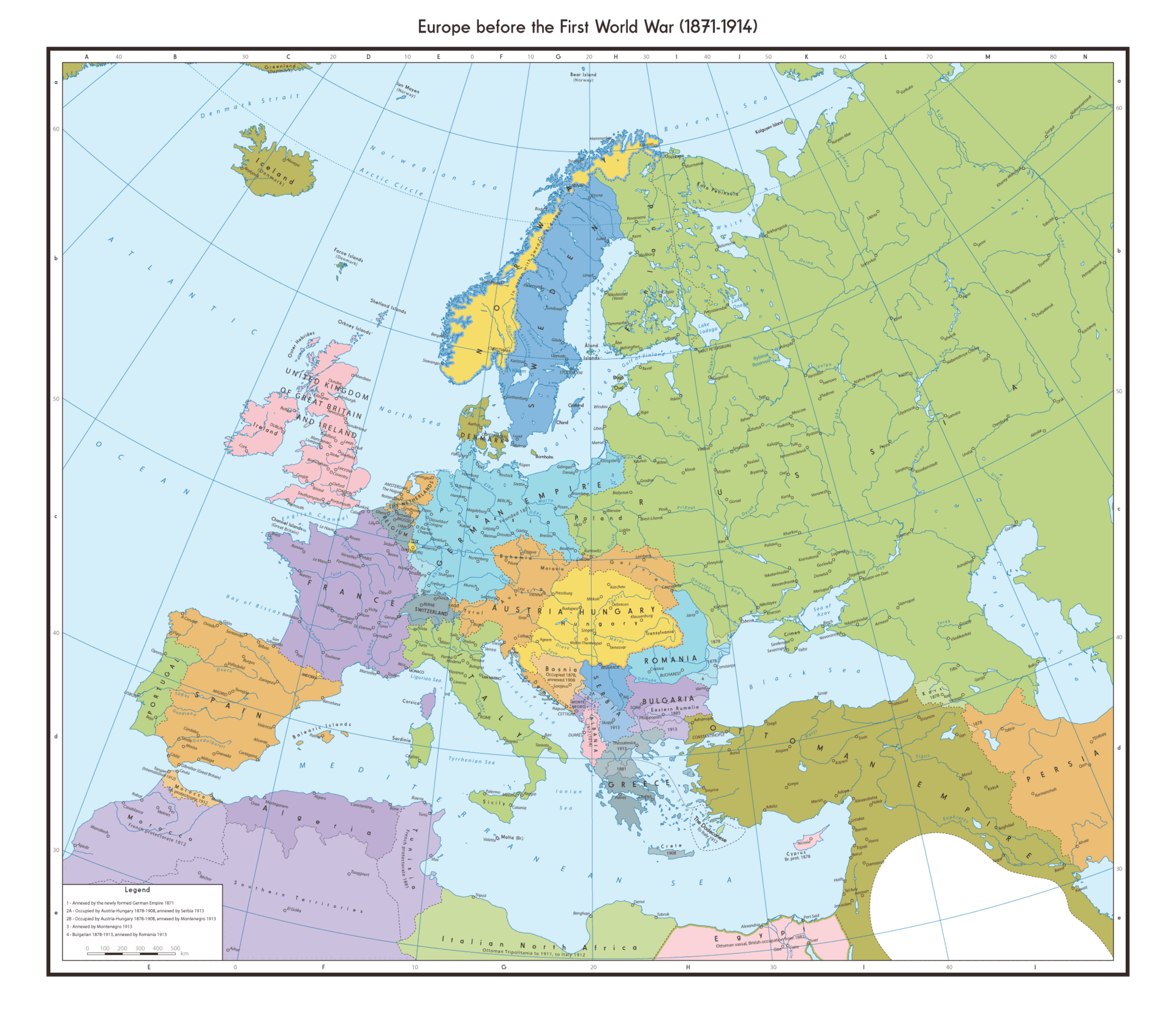
I’ve always loved maps and diagrams, and find it fascinating that representations of reality can look factual, yet be extremely political. I was particularly thinking about the ‘before’ and ‘after’ maps showing the states that changed, appeared or disappeared after World War One, and, of course the infographics showing the decades of Palestine’s borders being eroded.

‘Maps of Palestine’, an artwork by Richard Hamilton, 2010
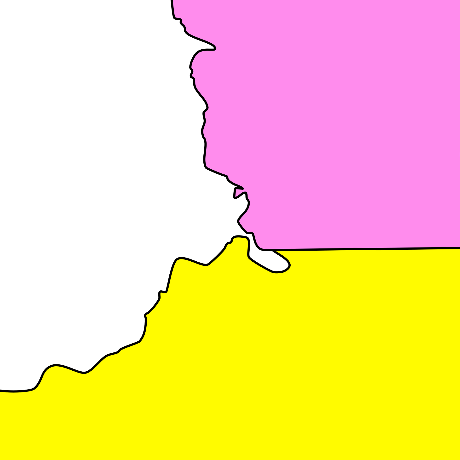
It seemed like it should be possible to create a map that was something like a geological diagram, from which an observer can interpret the order in which everything happened:
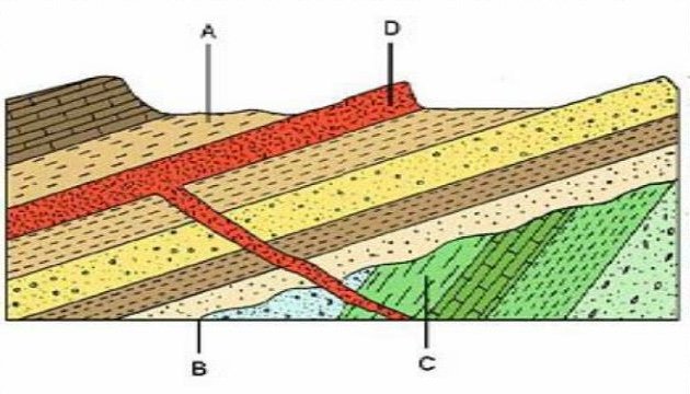
A geological cross-section from a test, showing two distinct phases of sedimentary rocks, and a “sill” (a type of igneous intrusion). Answer at the bottom of the blog, if I remember.
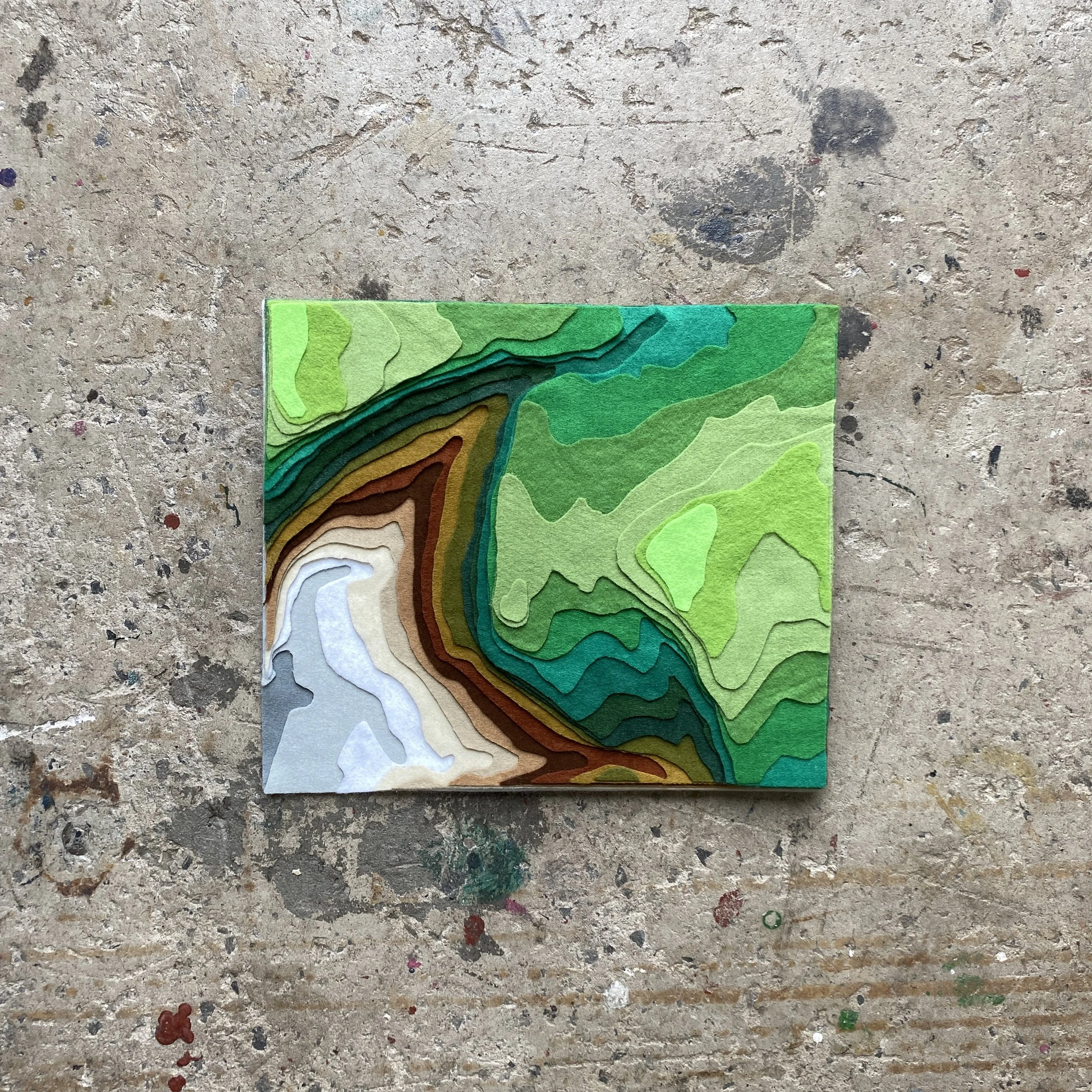
It therefore followed that I took the patterns used in geological charts and began to experiment. After painting on existing maps, and trying coloured pencil diagrams, I realised I couldn’t use the make-and-destroy techniques of improv quilting to achieve the effect I wanted.


The effect I wanted was something like this:
An animation made from digital drawings. It starts with a “map” of yellow, pink and white countries. Yellow expands (in orange, red and burgundy dots of growing size), White defends (in stripes of grey, then black), Pink capitalises (in purple diamonds and then blue squares).
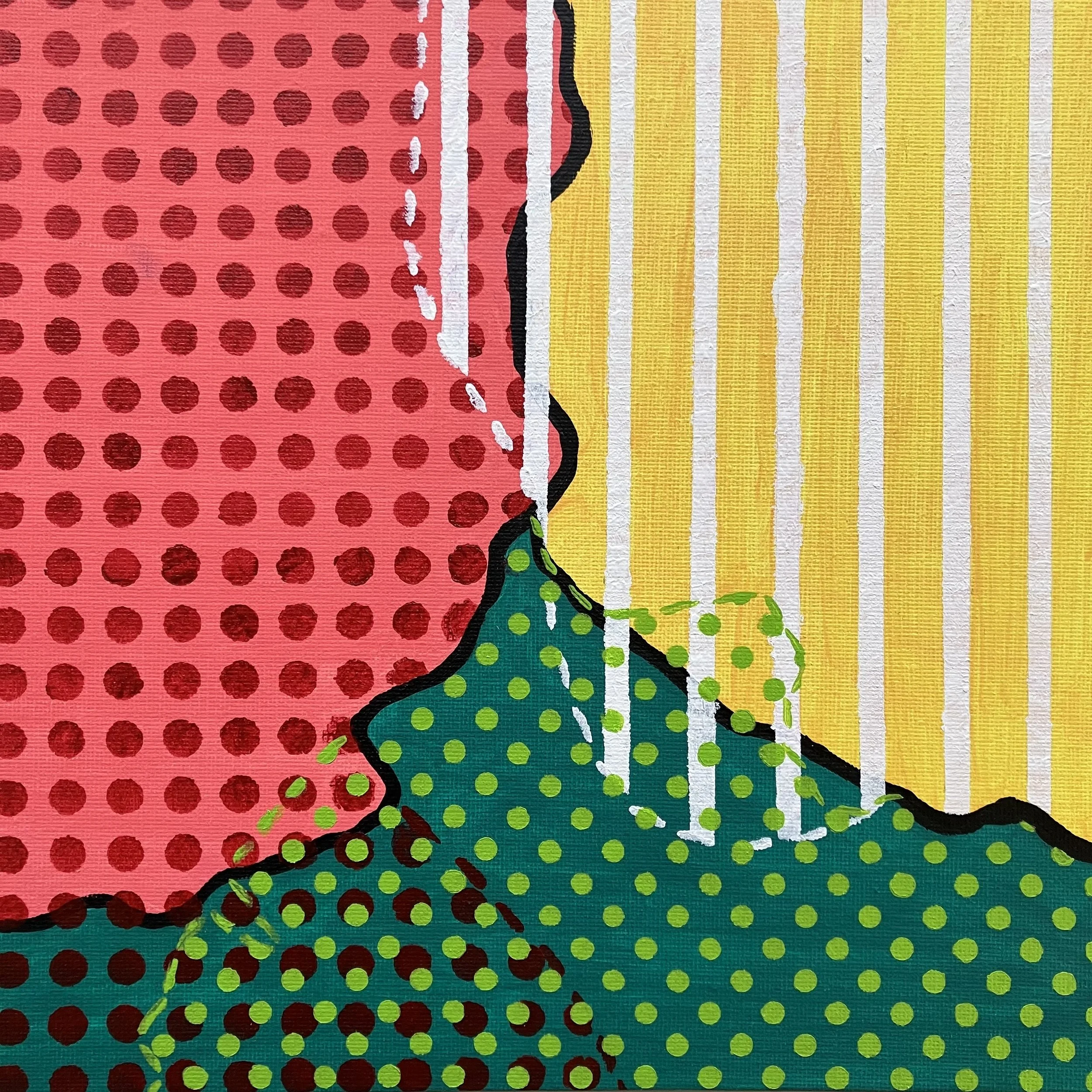
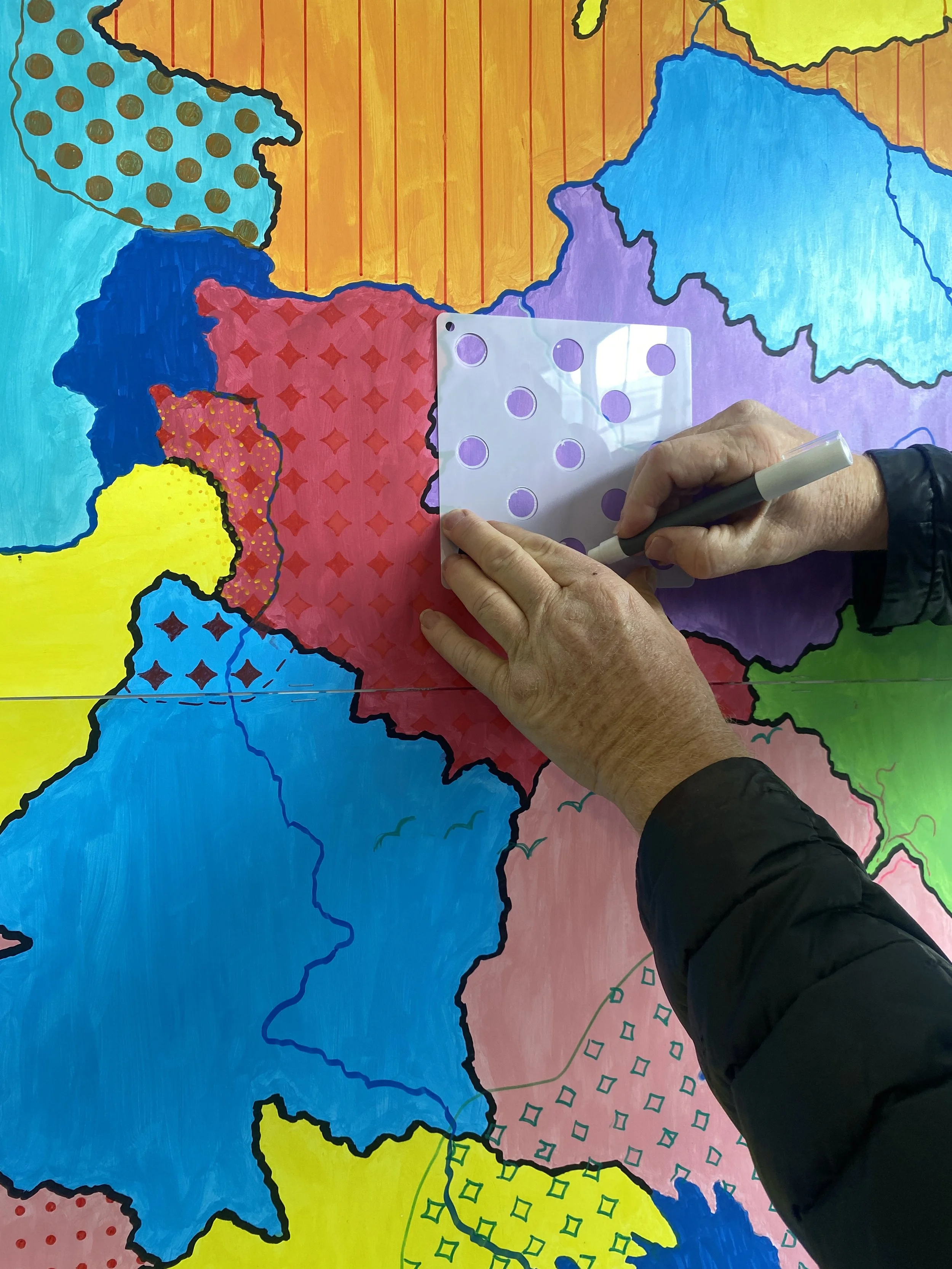
In the absence of any screen printing equipment or skill, I stocked up on cheap acrylic paint instead, and used a quasi-printing technique of using templates and tape to create patterns.
A small, 20cm-ish square attempt, with one round of '“invading” or “defending” for each of the three “countries”.
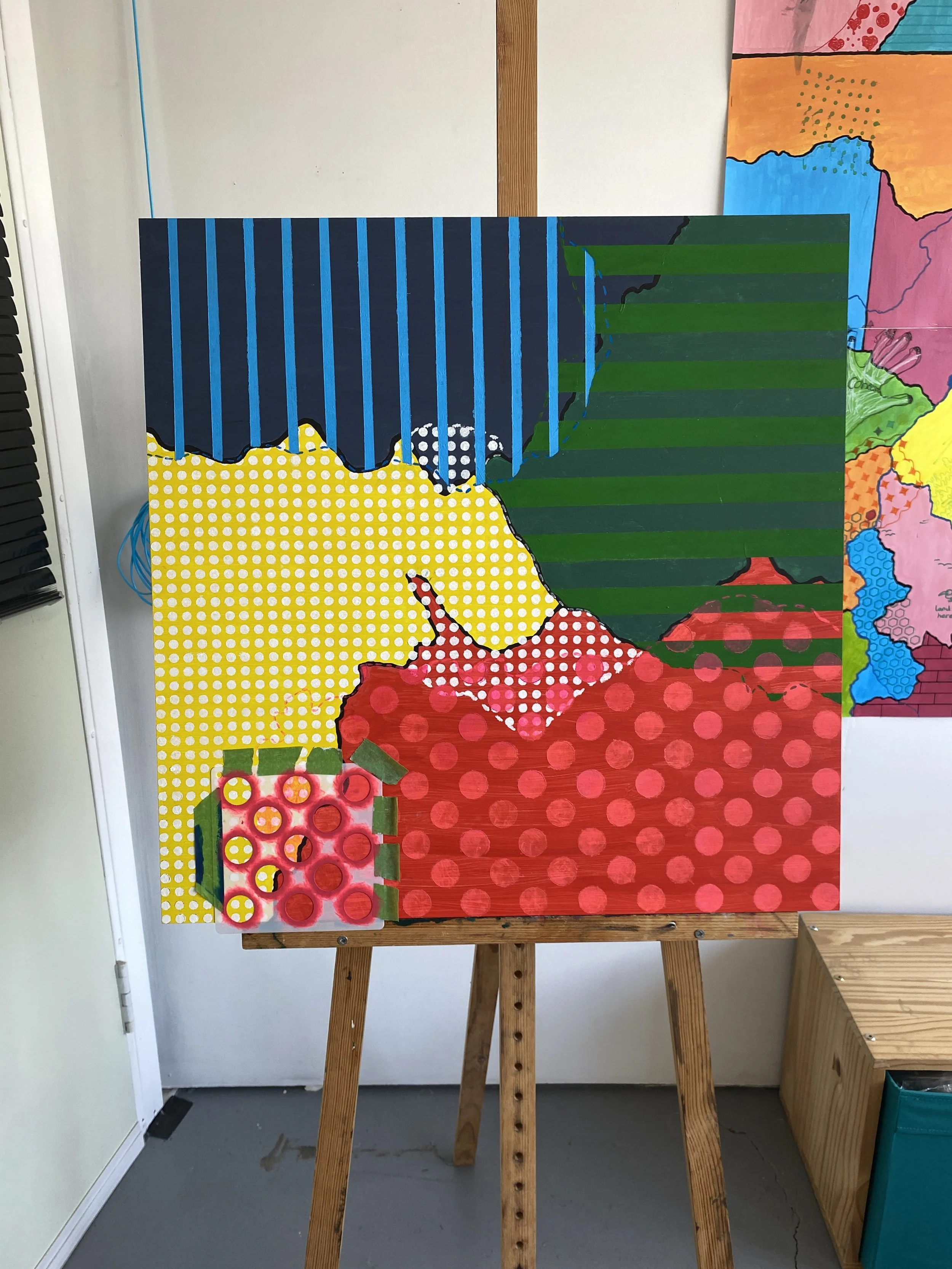
A much larger, 60cm square attempt on MDF, with one round of '“invading” or “defending” for each of the four “countries”.
Wars were breaking out on canvas board and MDF sheets, and they were sort of pretty. One round of invading and defending, illustrated by patterns, seemed to work, anyway. But where does the legibility of the boundary changes break down, and is that at the same point that the interactions between the patterns and colours becomes too disharmonious? What happens if you go beyond that point?
The short answer is this ugly mess:
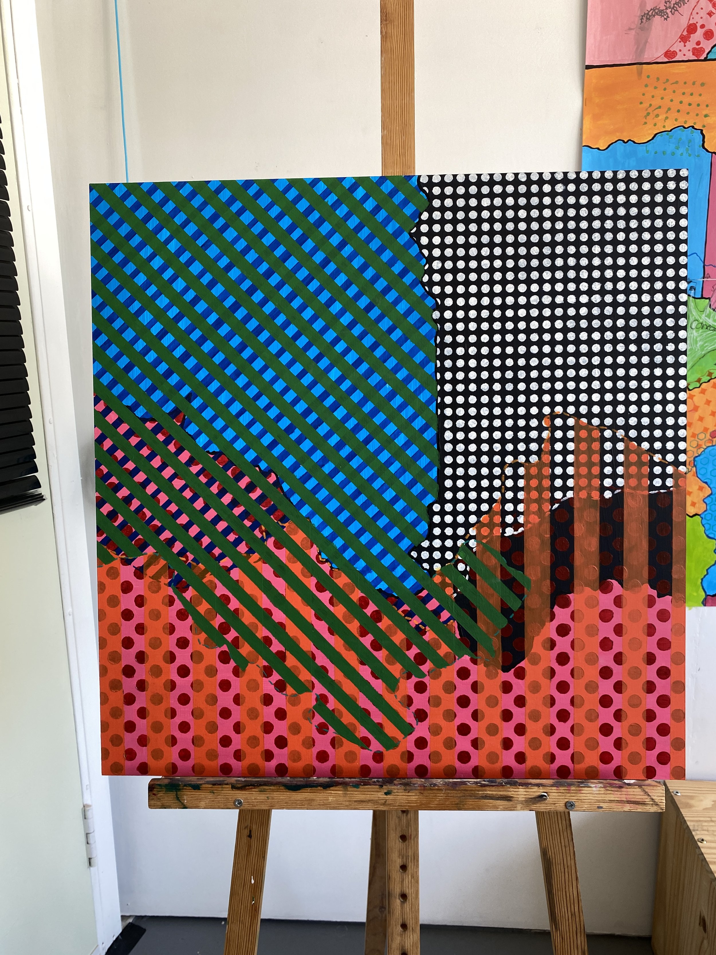
Another 60cm square attempt on MDF, with two rounds of '“invading” or “defending” for two of the three “countries”.
Even though these were early attempts that I should have regarded as experiments in developing coherent colour-coding and patterns, I found them disheartening, and also very boring: the process was not as quick as I’d first envisaged it.
(Maybe I’ll return to them. I’m not sure. Or perhaps if the one above is painted over, it will create some interesting textures. Stay tuned.)
A Collaborative Project Emerges from Desperation
In short, I wasn’t feeling confident or satisfied with my experiments. To be honest, I wasn’t enjoying time in the studio at all. However, I had still decided I’d like to participate in Open Up Sheffield (two weekends of open art studios in early May), having enjoyed it very much in 2024. The trouble was, I didn’t want these unfinished boundary/border paintings to be central, but I also didn’t just want to display the same things I’d put up the year before.
The solution: I’d transform four A1 sheets into a huge, fictional map, and invite my visitors to collaborate. (‘Collaborate’ probably being the wrong word, given the context.)
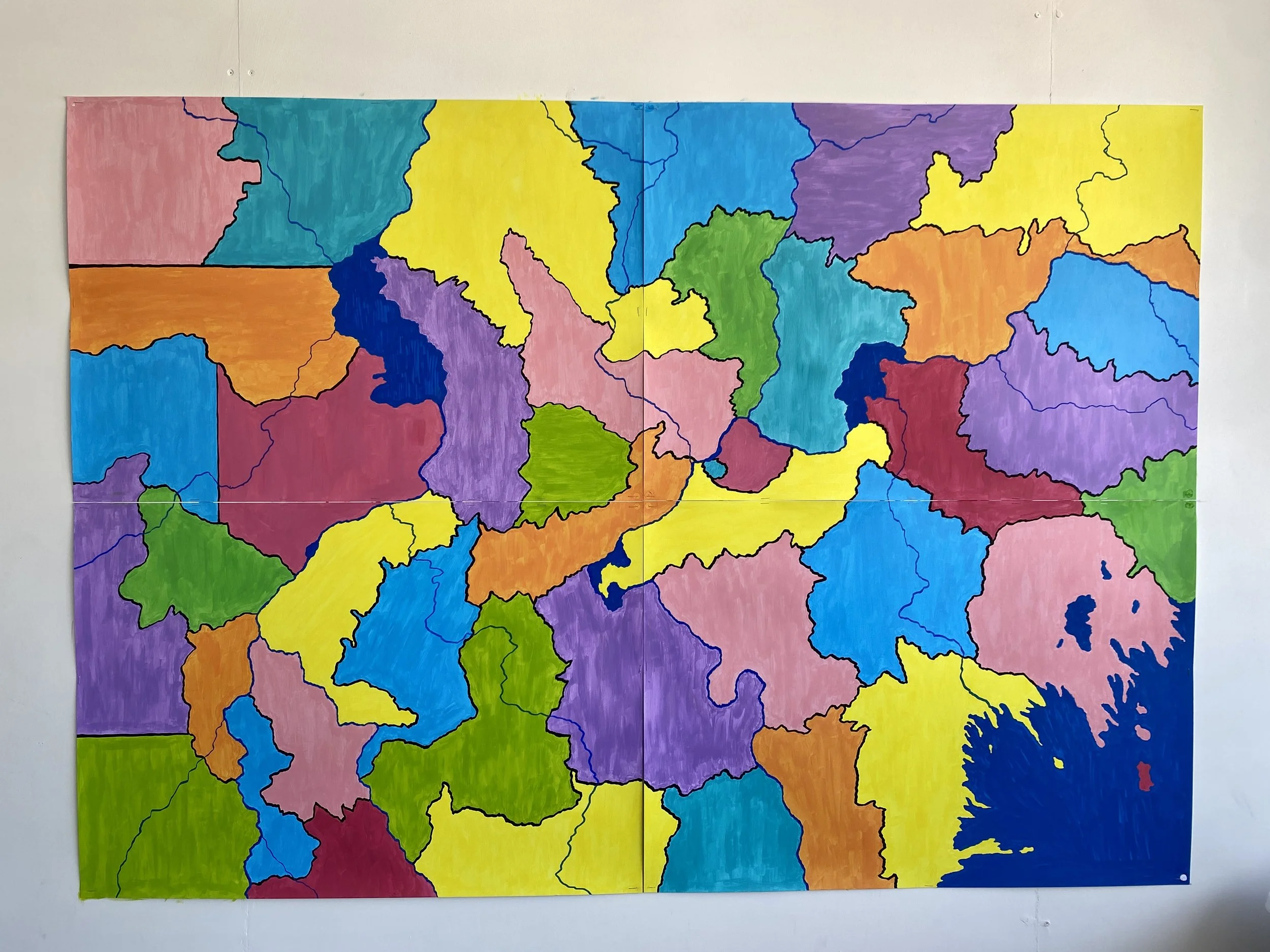
A fictional continent with many existing borders (and seas, and rivers) that took up most of one wall. 4 x A1 sheets = 2A0, apparently, in case you were wondering.
Day 1, May 3rd: an inevitable yet difficult loss of control
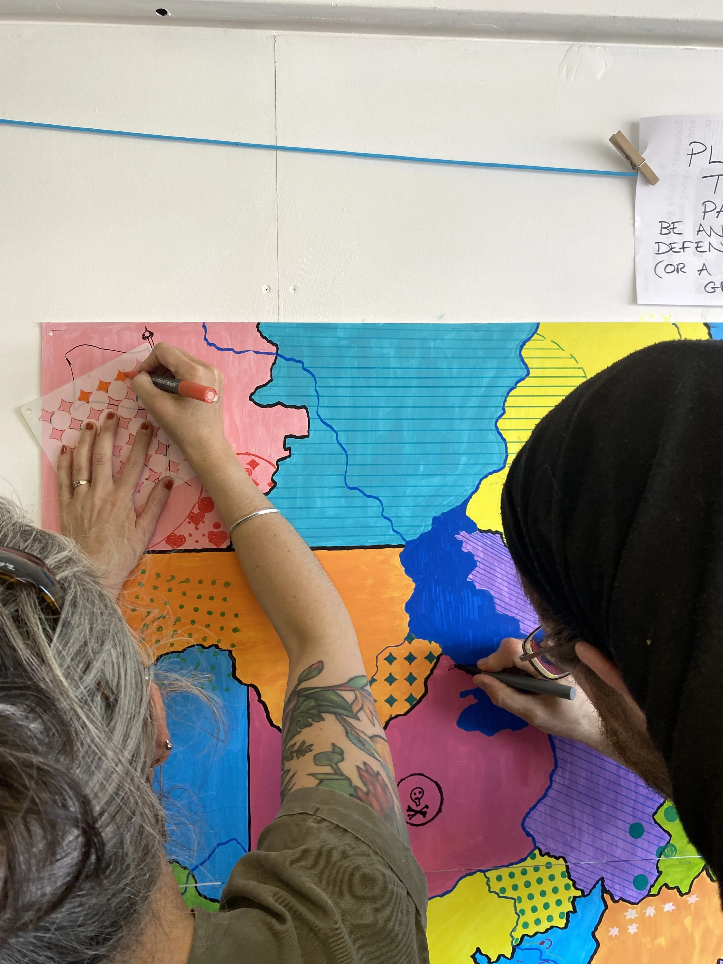
Immediately, I found it difficult to explain the instructions and the concept, even with my own attempts on display, but the first few visitors grasped the brief perfectly, and made their incursions into neighbouring territories.
(All photos of participants were taken with their permission, or with the permission of a parent in the case of children.)
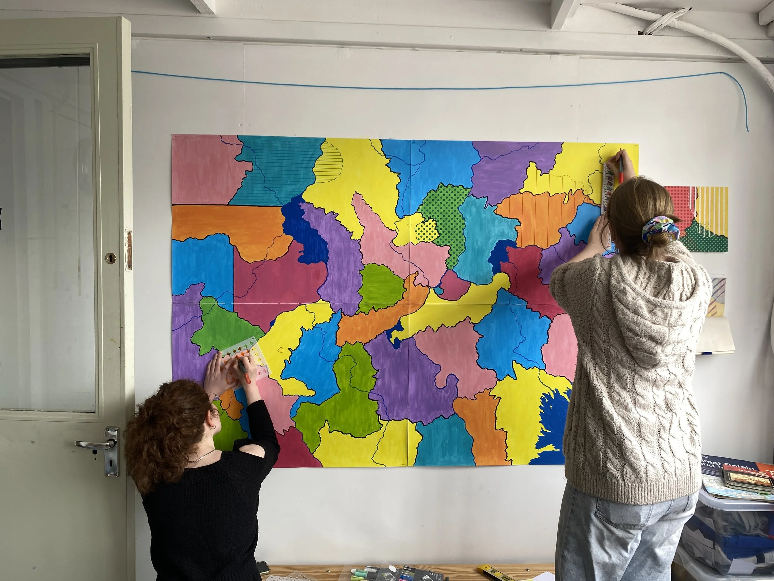
But then, the next visitors didn’t contribute in the way I’d anticipated. At first, this was due to my poor explanations. One person mistook a sea for a country, and a new land emerged from it. “A separatist state of sea-creatures!” I suggested, trying to shoehorn something I hadn’t expected into the parameters of the task.
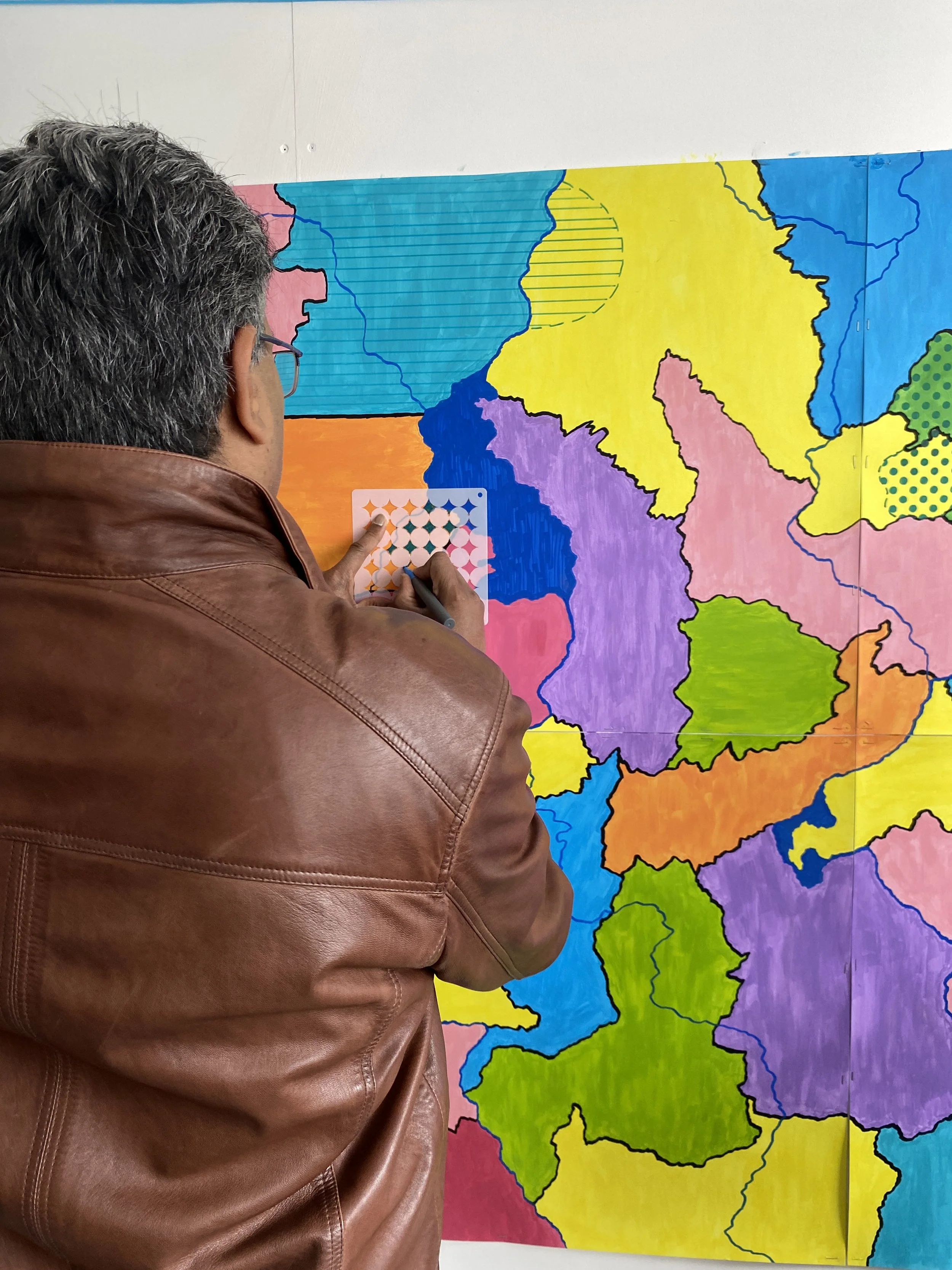
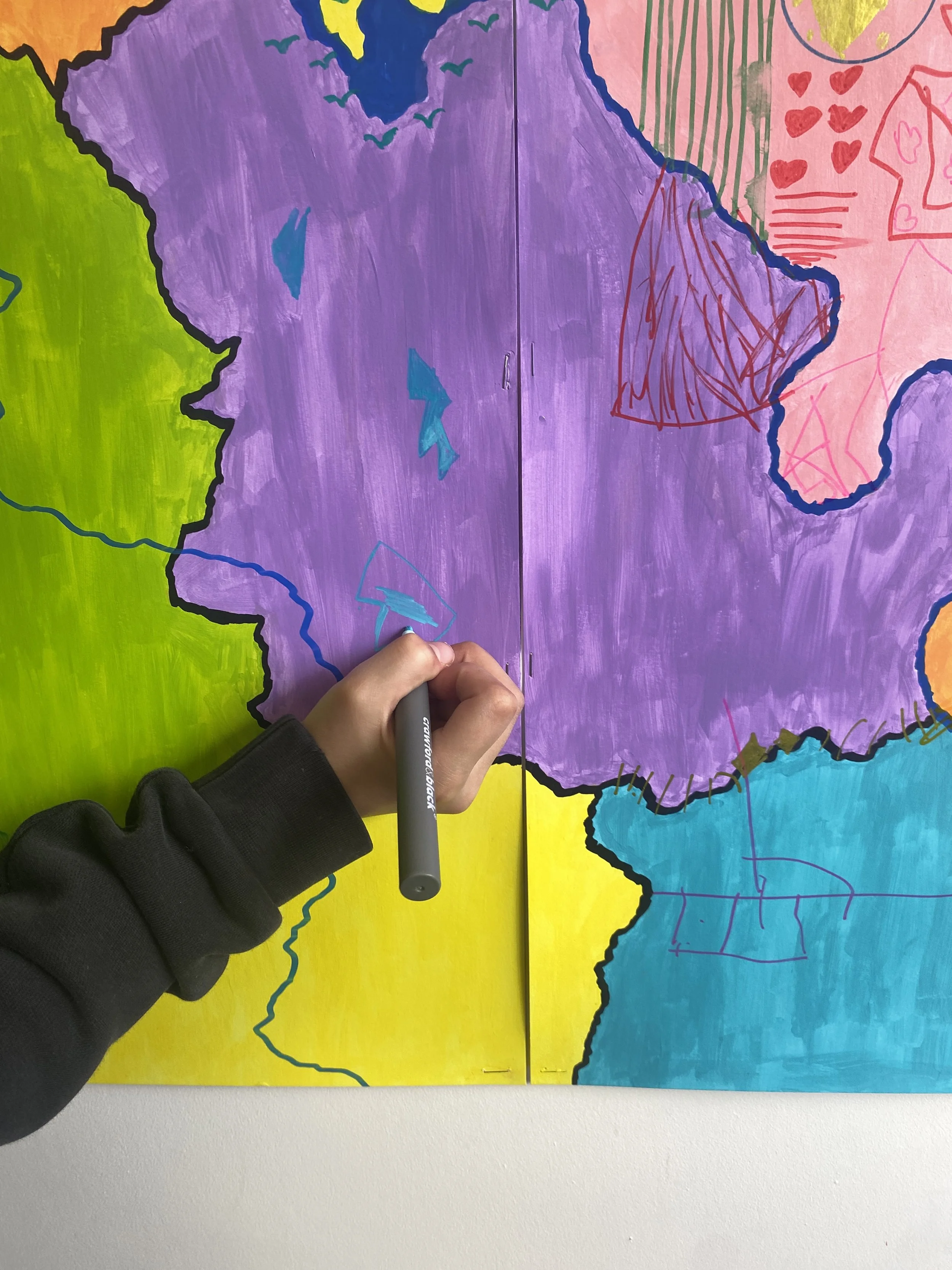
Additionally, the time-consuming nature of covering not only the new territory with a pattern, but the rest of the invading country too, meant people opted to just use a similar colour to denote a country’s advances without creating a new pattern for the whole country. That made perfect sense for anyone not wanting to be at the wall for half an hour, but it wasn’t what I’d wanted, since it wouldn’t lead to patterns overlapping.
I had serious thoughts about “cheating” by secretly amending the contributions so that they’d be done “properly”. Then I gave myself a stern talking to for even contemplating this.

I was slowly realising that this probably wasn’t going to be the project I’d envisioned. And yet, clinging to the original idea, I thought there was still a chance: “I need to make a simple sheet of instructions,” I thought, “so that people aren’t so confused.”
I made the instructions.
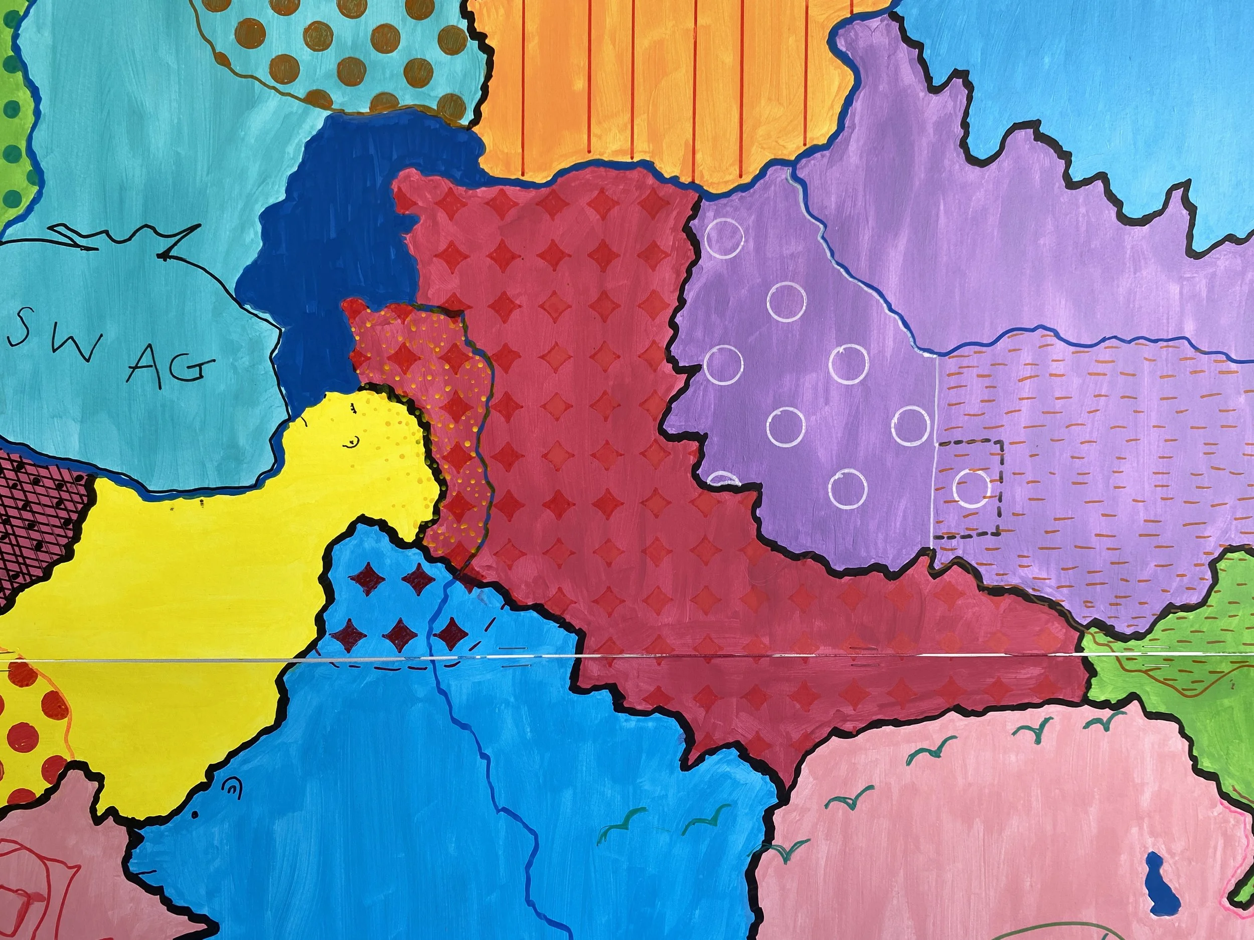
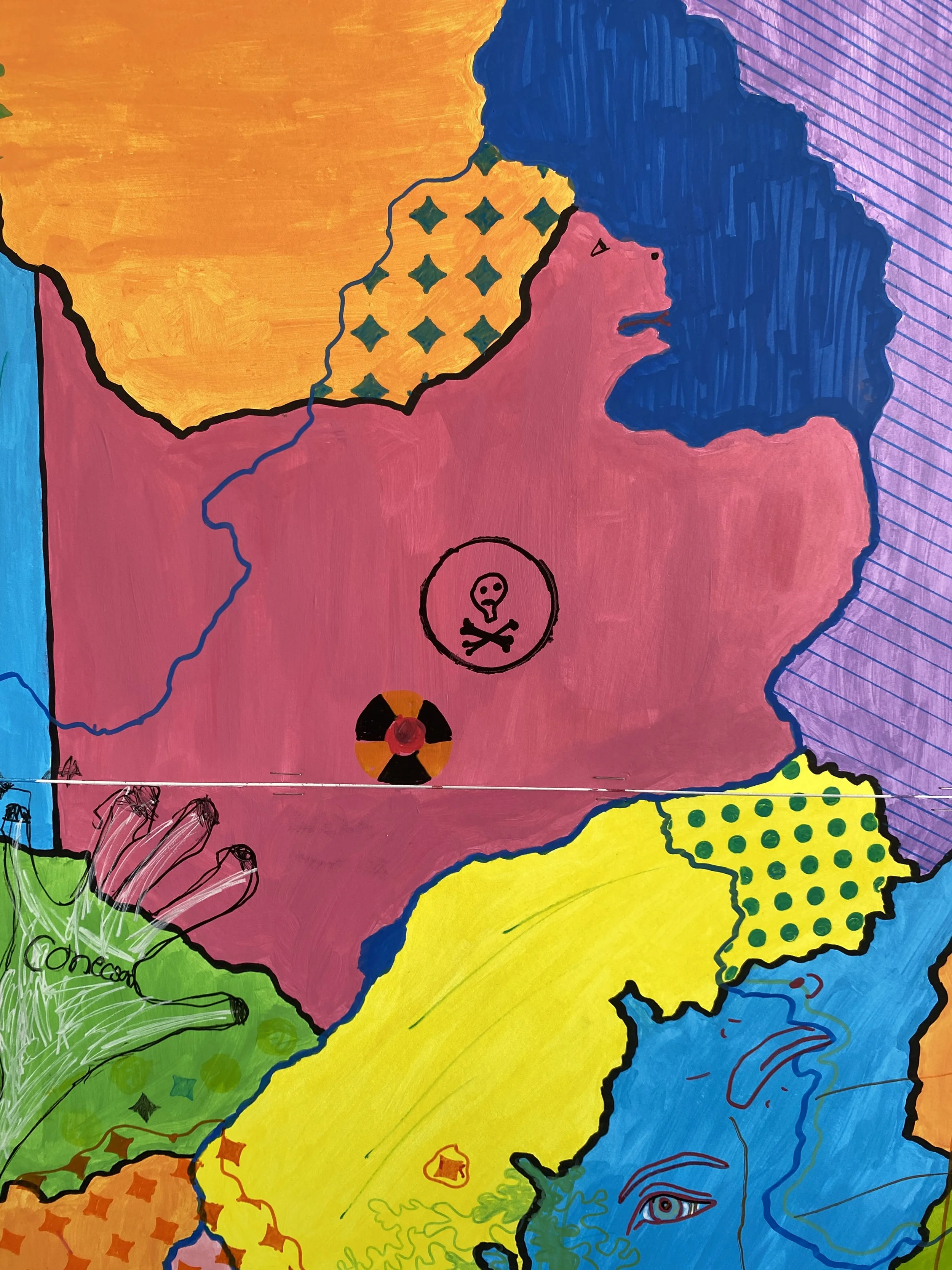
A nuclear exclusion zone emerged.
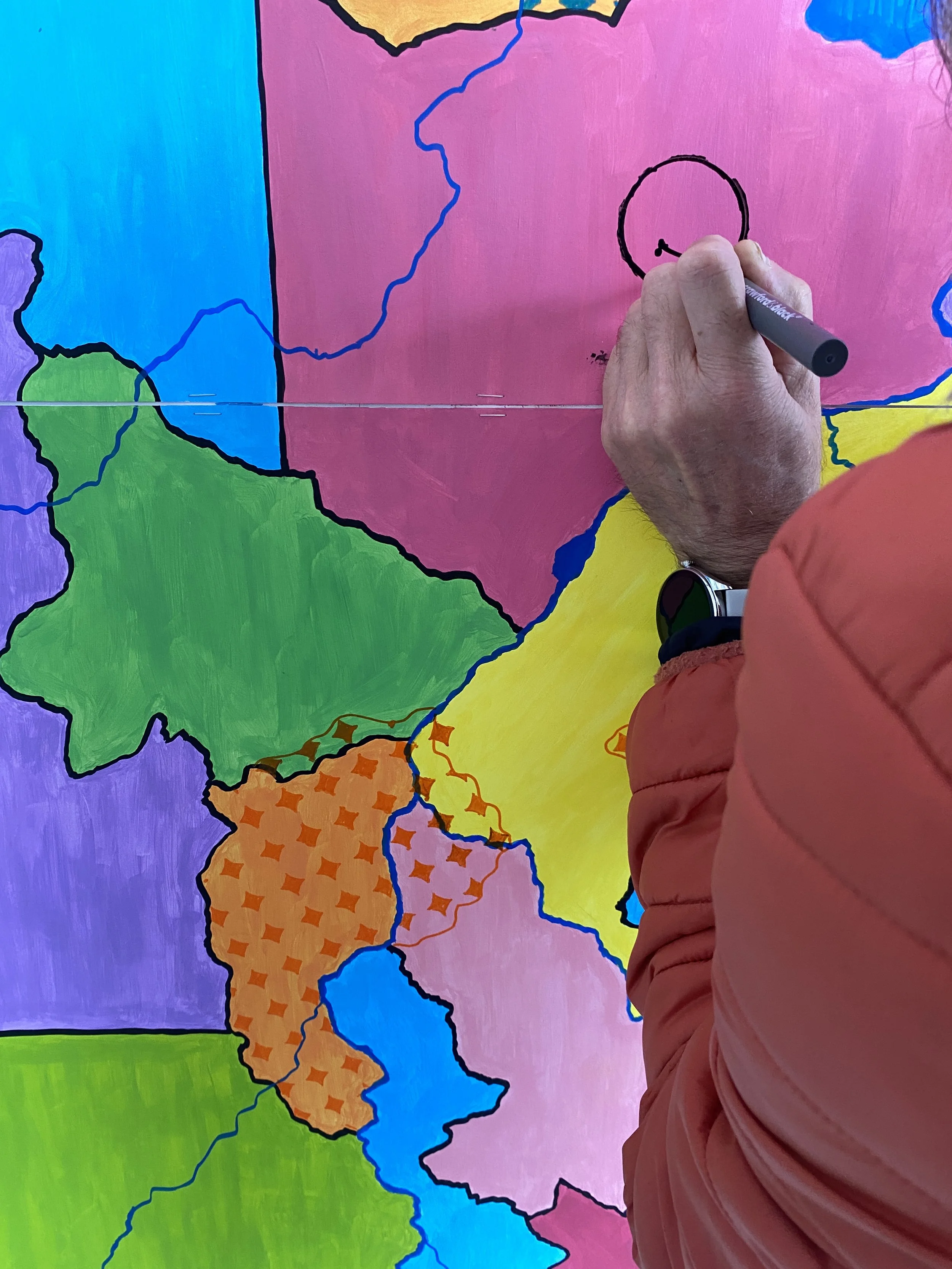

Then, two women also actively rejected the instructions: they ‘united’ borders. Other people added textures to existing states without them having (been) invaded. Still, I was reluctant to lose total control of my original narrative: the ‘unified’ borders were more separatist groups! The addition of patterns to countries that hadn’t expanded was due to defensive governments, or maybe there had been a coup!
People had taken part, I reassured myself. That was the main thing. And perhaps more importantly, they’d enjoyed taking part.
I was keen to see what would happen the next day.
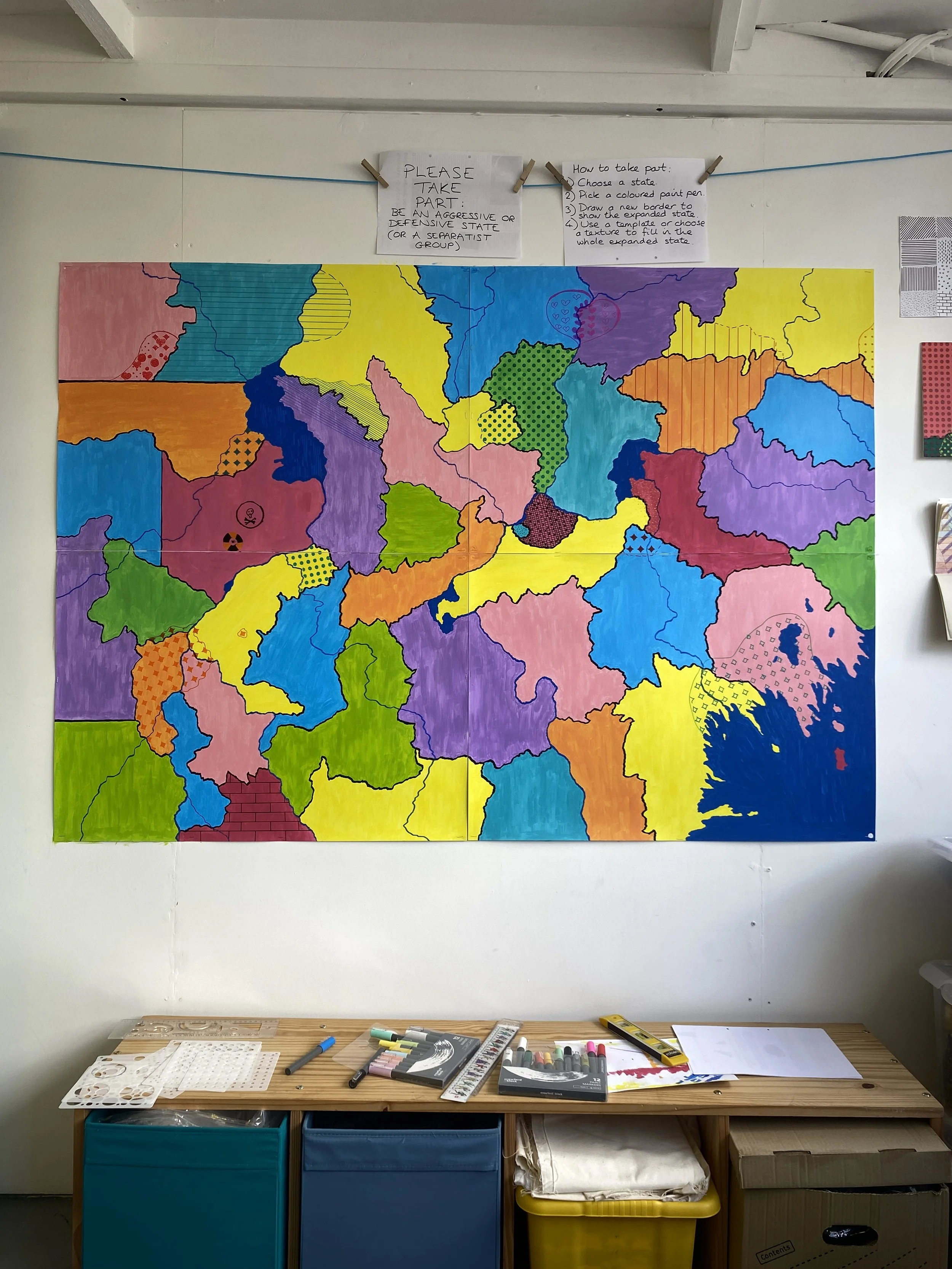
The map by the end of Day 1 of Open Up. Note my attempts at instructions above the map, and the two heart-y borders close to the top of the map. There’s also a great enclave/exclave in the bottom right quarter.
Day 2, May 4th: a grotesque intervention changes everything
It was a quieter day, but two things were clear: 1) the instructions were helpful; and 2) they were there to be ignored.
The additions got wilder: one man decided that the shape of an appropriately blue country resembled the Spitting Image incarnation of Maggie Thatcher, and so he drew her caricature. Given that the purple country to its right seemed to resemble Donald Trump far more than the blue was reminiscent of Thatcher, I was perplexed as well as horrified, but it was done.
The Spitting Image homage is in the bottom left quadrant.
Actually, this purposefully grotesque addition was game-changing in terms of the conversations I had with visitors, and for how people engaged with the “instructions”. Adding Maggie Thatcher made people think of wars in their lifetimes, including the Falklands, and the way those conflicts had affected them, their communities, the world.
Given this, perhaps it was then that it dawned on me that asking people to engage in a fictional act of aggression in a collaborative work was problematic for at least three reasons, and probably many more:
1) My own paintings were under my control, and the fictional acts of war were there for my own creative purposes: a critical commentary, or something. Adding to, or disrupting, or destroying communal work is different. Maybe it is more akin to real conflict, and no doubt people did find being asked to “invade” or “defend” uncomfortable.
2) I’ve never not lived on this island. The last time an enemy force invaded mainland Britain was the bizarre and unsuccessful 1797 Battle of Fishguard (which I’d never even heard of until I attempted to find out what the last invasion actually was). But many people who visited my studio were European, and on mainland Europe, there is currently an invasion. Within my lifetime, hundreds of thousands of people have been killed and millions displaced due to conflicts. Invasions are not theoretical for continental Europeans in the way they are for me: they are real.
3) In conceiving of the project as something of a game, albeit one with serious political and moral undertones, I’d also failed to consider the responses not just of people who’d find it too on-the-nose or crass due to living on continents with recent or current conflicts, but those who have fled them or who have relatives still affected by conflicts. I was trying to have my cake and eat it too.
And so I became grateful for the rule-breakers and the way they broke open the project. The presence of previous rebellious decisions on the collaborative map – perhaps most strangely and strikingly, Maggie Thatcher – gave people other creative options than to play Risk during a politically and morally febrile era, and they embraced them.
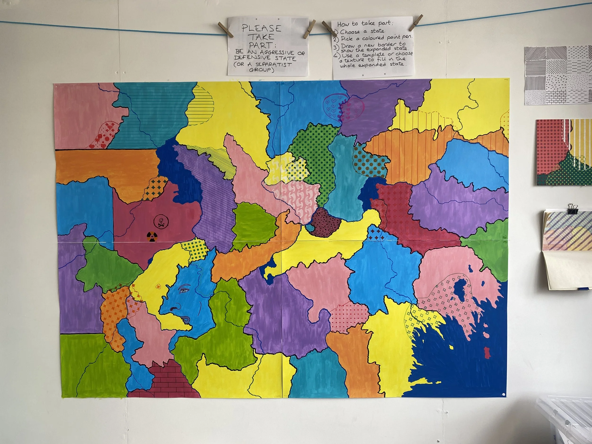
Day 3, May 5th: Acceptance
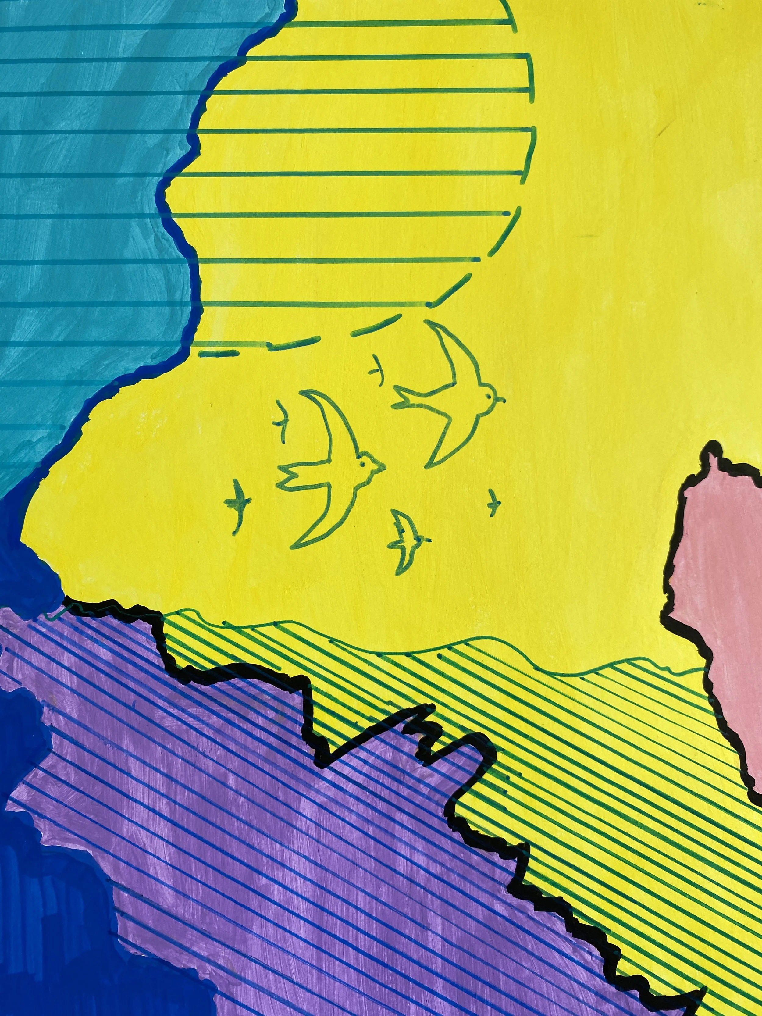
On Bank Holiday Monday, birds appeared, indicating both a huge nature reserve that might show collaboration between countries, and symbolising the fact that wildlife has no concept of borders, and especially airborne creatures.
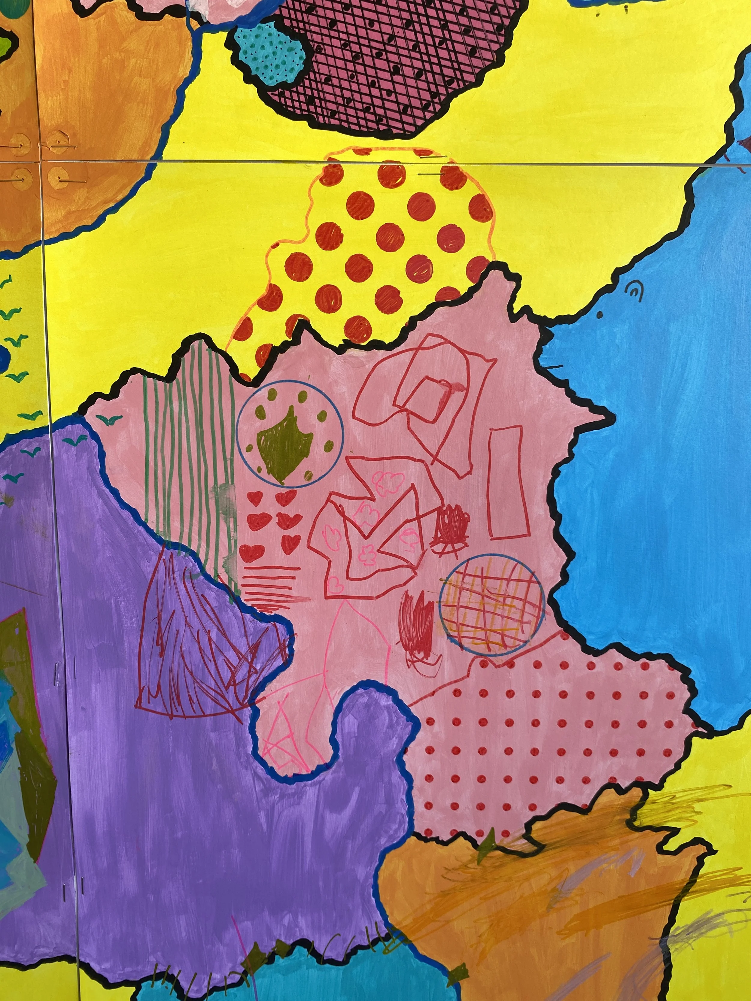
The resistance to the brief intensified. Parents encouraged their children to make creative contributions rather than obey the rules. Attempts were made to erase borders. Bridges appeared, linking land-locked countries to the sea and to other countries. One young boy added bananas! (Clearly, he was considering the importance of trade in geopolitics.) Interesting symbols were added, which could be interpreted as cultural traditions or landmarks, many of which define national identities, or otherwise expand across boundaries.


Then two more avian flocks were added, one of which I didn’t even see appear, and a young boy – old enough to have strong feelings about the US president – decided he’d camouflage the area I thought resembled Trump. His mum added the “Gulf of Love”.


Inspired by the caricature, a man added a Spitting Image tongue above Thatcher, my feelings about which showed that I had not yet fully relinquished control over the project. There were rules, and rules about breaking the rules!
The map at the end of Day 3.
Days 4 & 5, May 10th & 11th: the true takeover
The next weekend, though, some people did follow the rules! Others listened to my heartfelt pleas and tried to save us from Thatcher’s countenance by obscuring her, slightly, with patterns.


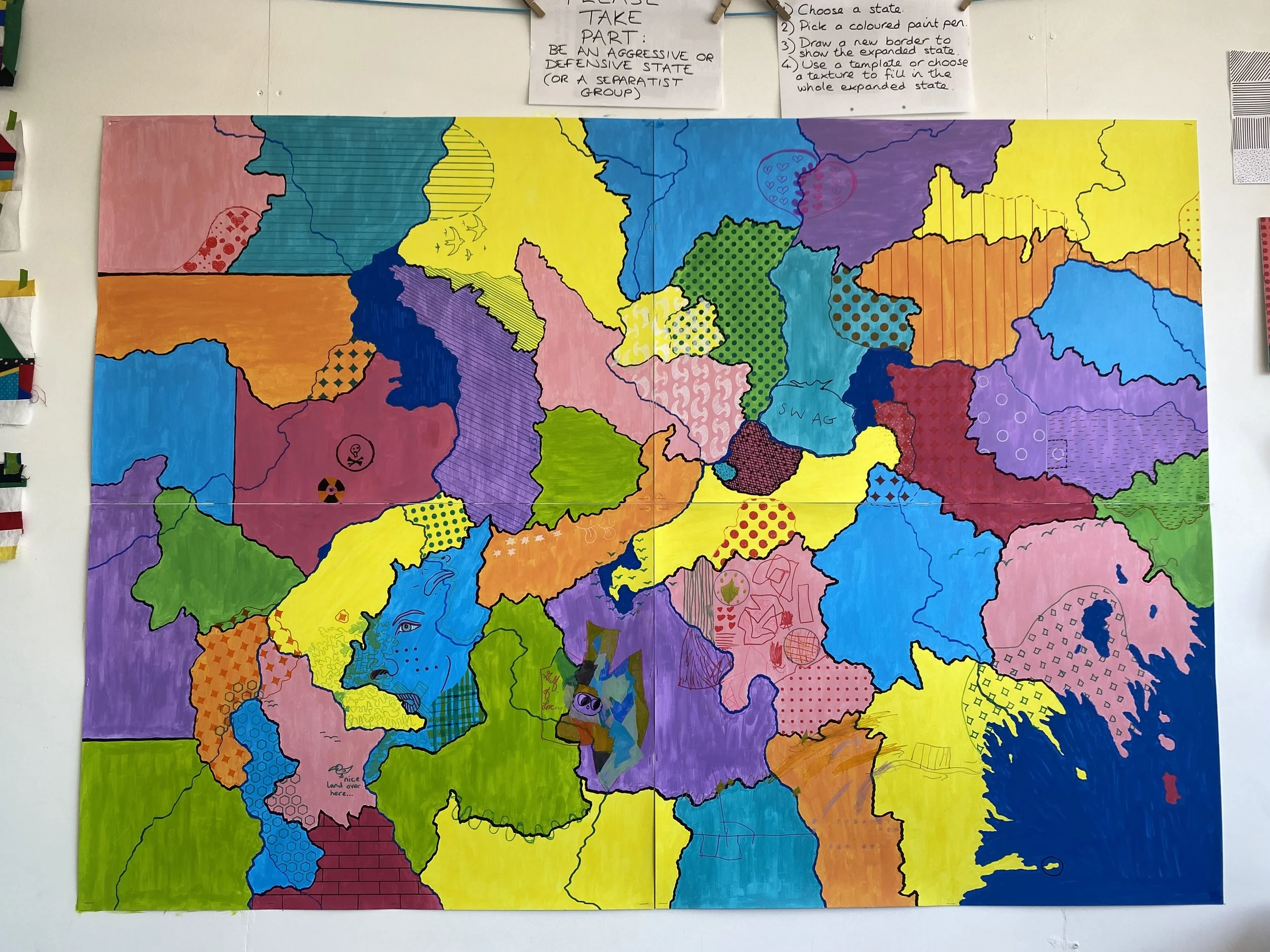
The map at the end of Day 4, now with three tongues, more patterns, more birds, and a swag bag.
One man, struggling with the dilemma of not wanting to follow the rules but being alarmed by the extent to which he could break them, said, “This is terrifying! I could do literally anything. I could draw a huge rectangle across most of it.” He didn’t. He added contours, in yellow, to a yellow country.

A Canadian woman added a flag and barbed wire while her partner added faces to some outlines. I’d always thought that barbed wire had been an ugly invention to defend World War One trenches, until I’d bothered to look it up and had seen that it was American. She told me about the impact that trying to control cattle in huge expanses had had on migrating wild animals, and on the people who relied on those migrating animals.
Three faces appeared. I was glad of the additions. They put me in mind of ancient cartography, and the inclusion of anthropomorphic elements. Here be monsters.
A friendly blue bear and a sleeping (or dead?) yellow woman.
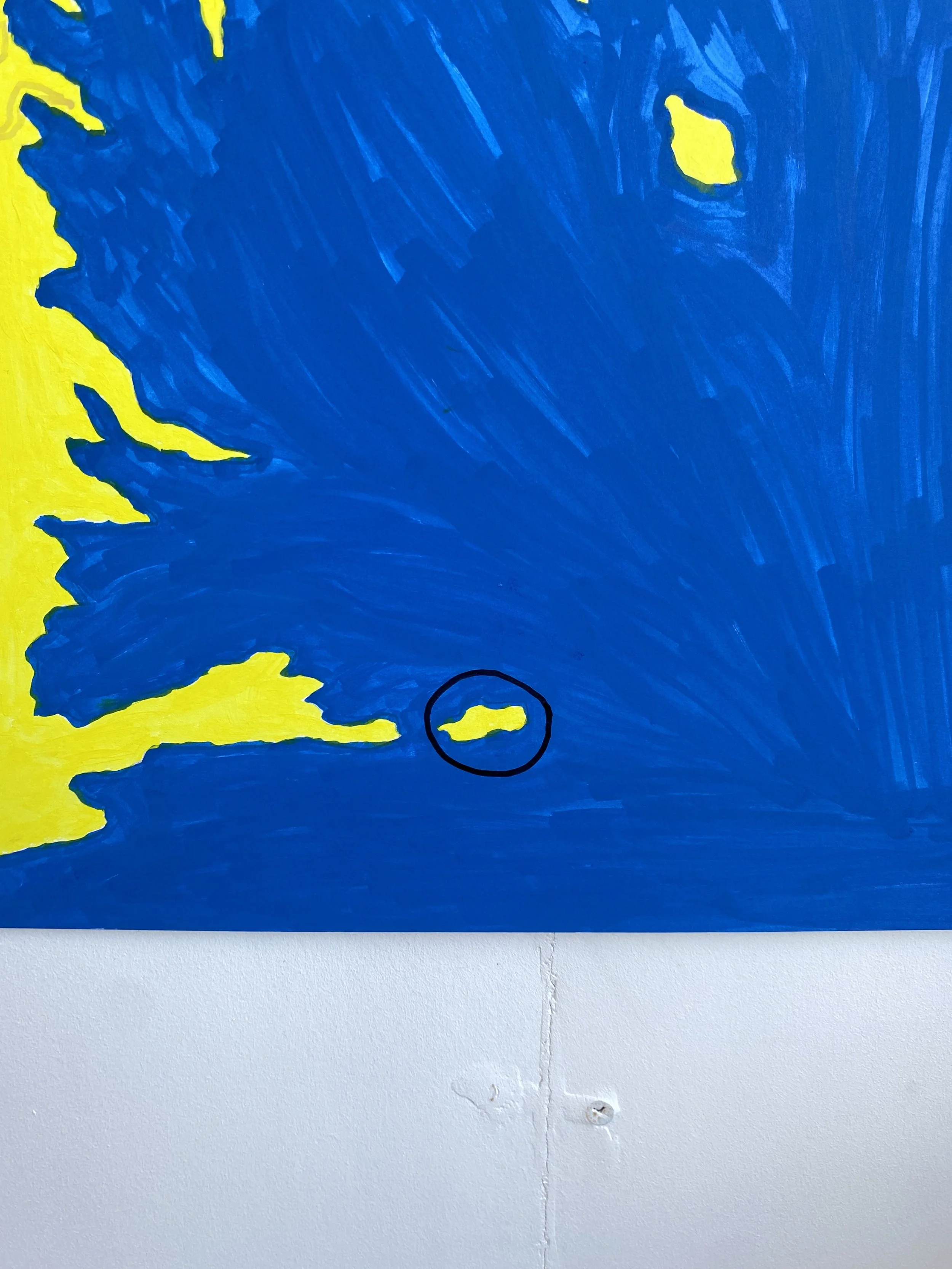
A pink serpent-mammal-thing forms from the pink nuclear zone.
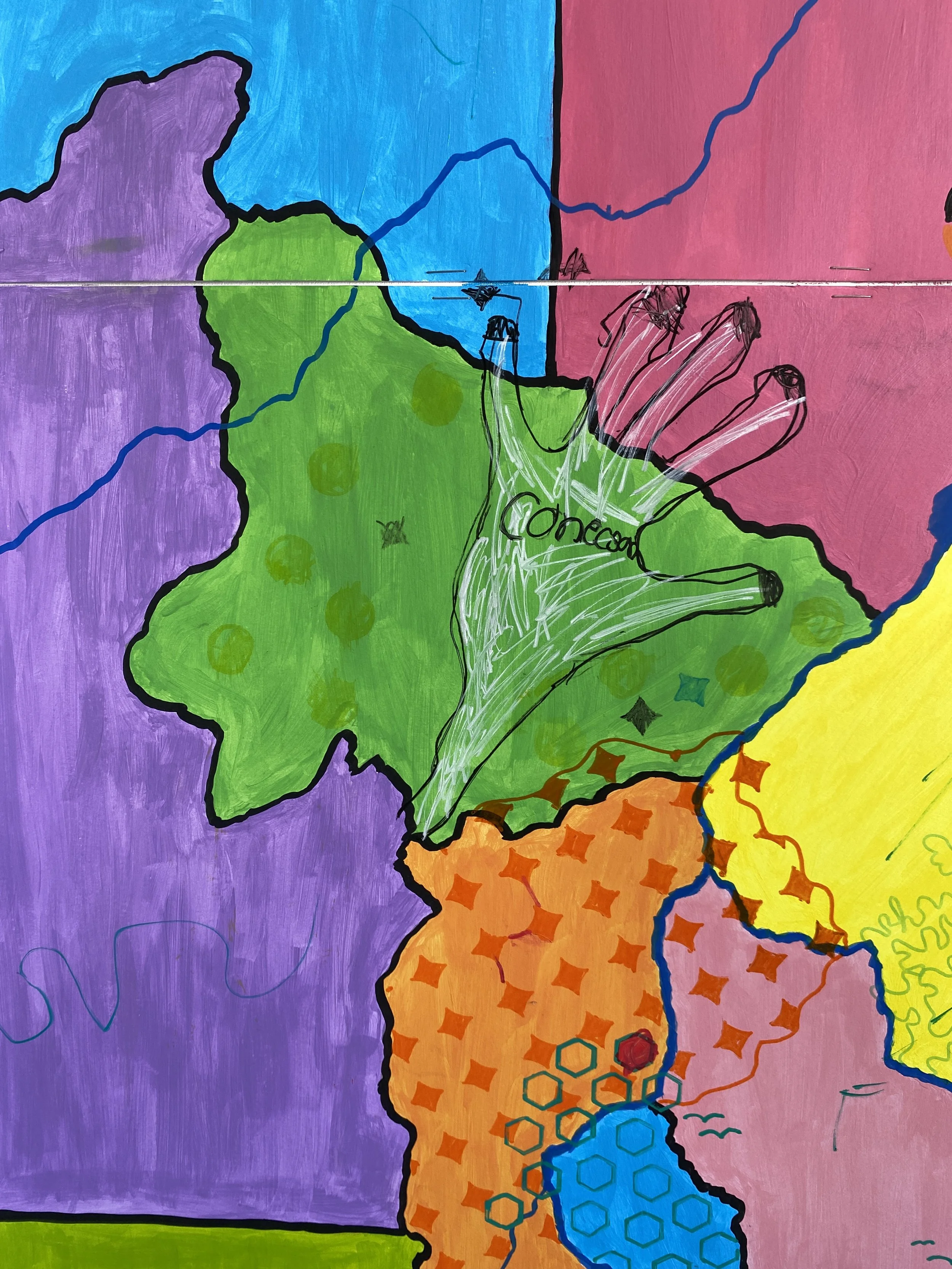
One of the final additions was a hand that a young girl drew, reaching across countries. Her dad joked that it could be representing a literal land grab. She added her spelling of the word “connection” to show her true intentions.
So many symbols appeared on the final day, whether of individual significance, or with international meaning, some serious, others playful. Perhaps at this point in the collaboration, people didn’t want to “intrude” on others’ contributions and were happy to just make a mark, cryptic or not.
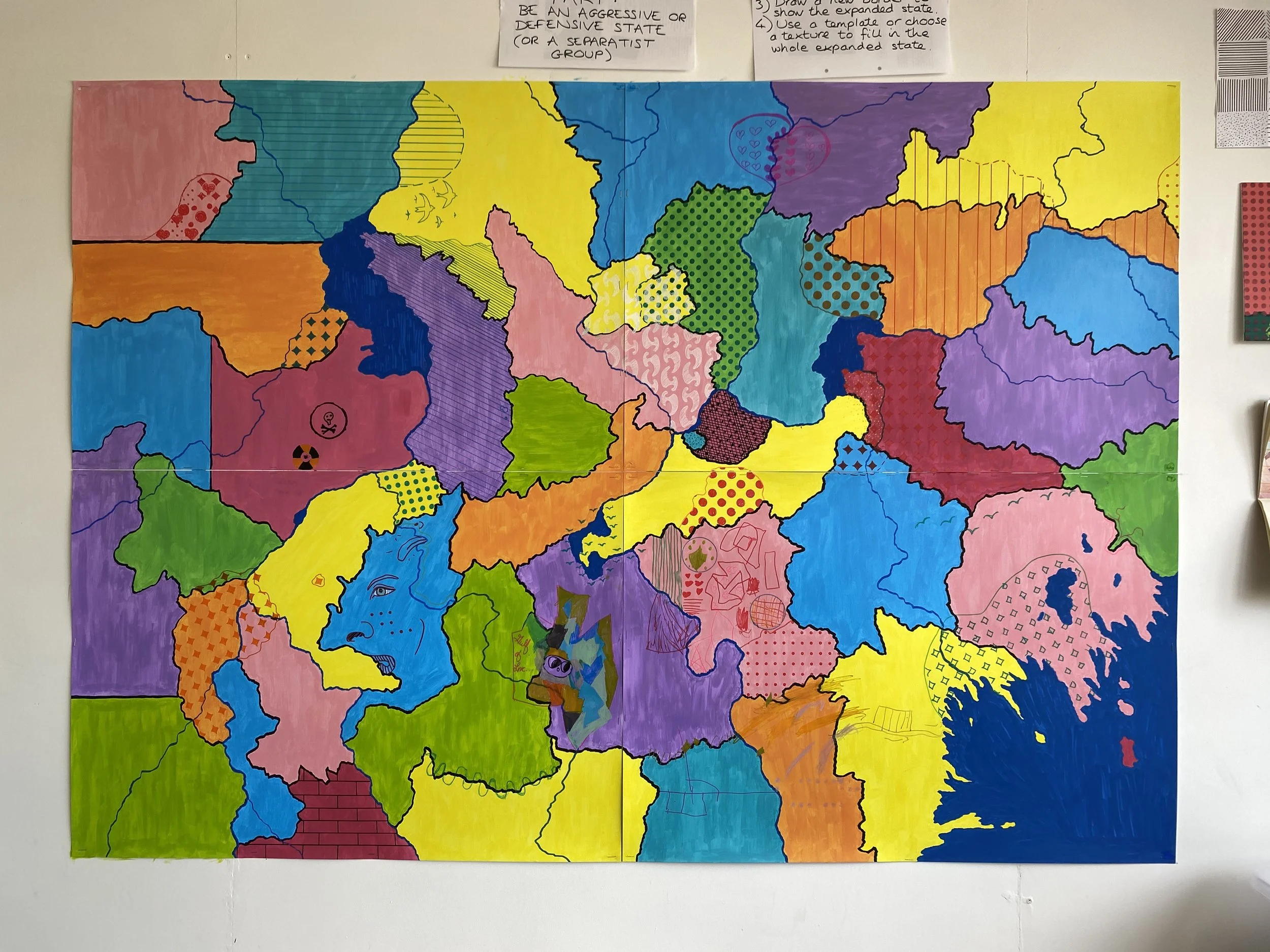
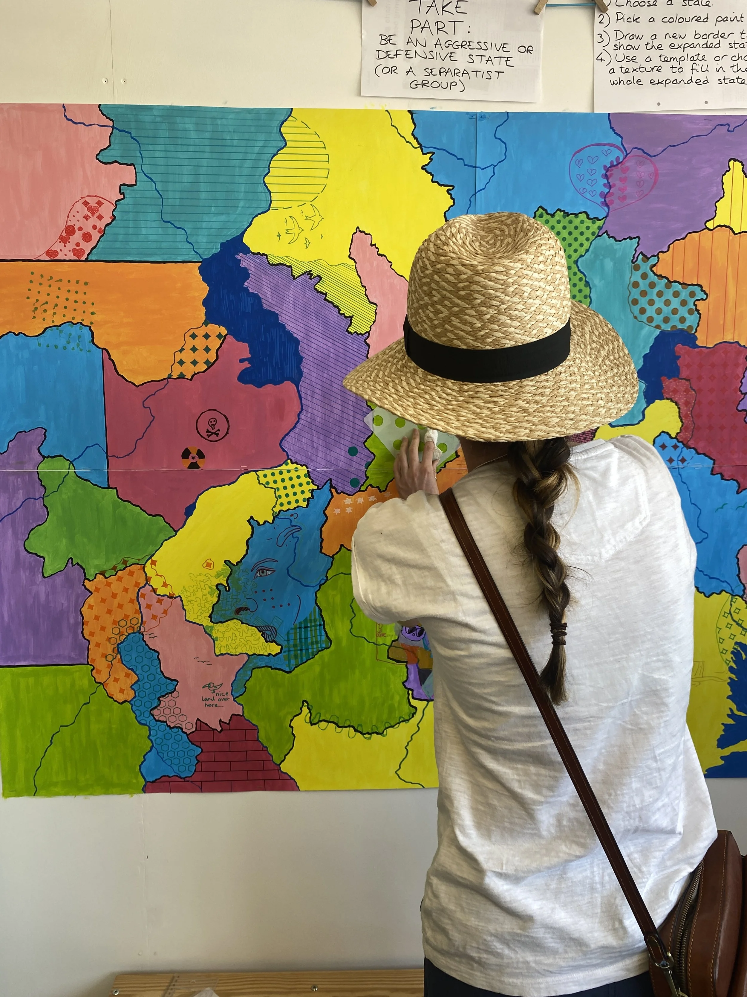
The final map. Only two countries remained completely untouched.
Conclusions
Were there overlapping patterns in the end, creating new textures, as I’d intended? Yes, in a few areas. But on the whole, the map contrasted gloriously with all my expectations, which I’d finally jettisoned on the last day, thanks to five days of watching people making marks and having conversations with them about their choices.
I’m very grateful to every person who decided they’d pick up a pen and get involved: every contribution was significant, and the cumulative effect was fascinating. Thank you in particular to the rule-breakers, who steadfastly refused to play at war, who symbolically stuck two fingers up at the project in the kindest possible way, and who taught me some important lessons in the process. The fact that so many parents encouraged their children to ignore the instructions, and the fact that many children never intended on following them anyway, gives me hope.

And I’m also thankful for all the conversations I had with visitors, whether they contributed or not. Some discussions weren’t about this project, but many did stem from aspects of it.
For example, one man just happened to have a blog up on his phone featuring old photographs of European border posts. He showed me a picture of a three-way border, and we then found the location where the photograph must have been taken on an old map of Europe that I serendipitously had to hand.
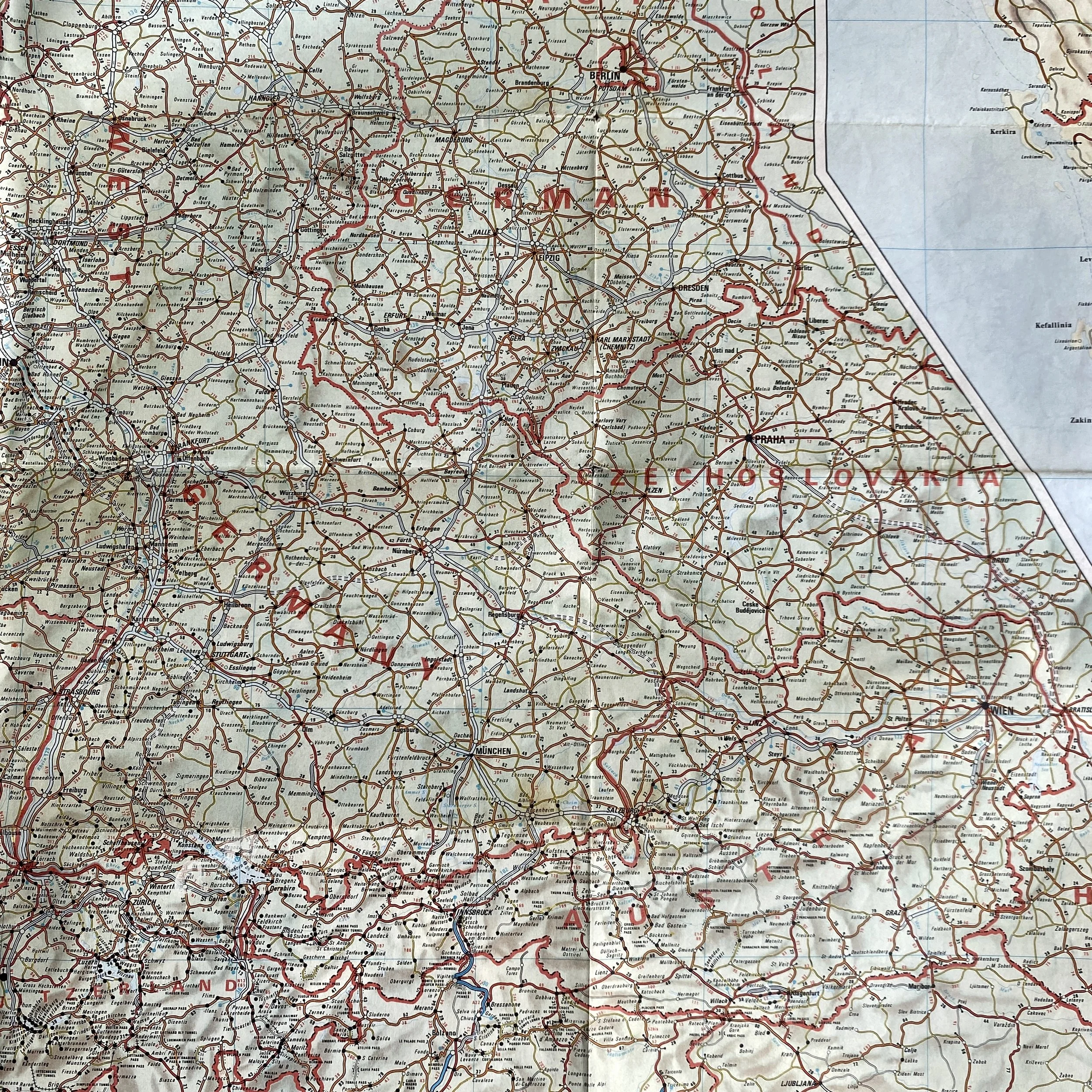
An 80s road map of Europe. I think the location of the photo (which I’ve since searched for and can’t find) was the border between Austria, West Germany and Czechoslovakia.
Two European men, intrigued by the enclave that a woman had added early on, told me all about exclaves: I’d not heard of them, and hadn’t heard of counter-enclaves either. They were talking specifically in reference to an extraordinary village called Baarle, which is a mixture of Belgian and Dutch territories:


I also learnt about the existence of star forts, which I need to discover more about.
The Future
I have since left my studio at Trafalgar, and have moved into a space in Persistence Works, part of Yorkshire Artspace. I’ll be taking part in their open studios event on Saturday 15th and Sunday 16th November, 11am - 5pm, so please come along and say hello. My new studio space is fully accessible and on the ground floor. There may well be some collaborative or interactive projects going on. In fact, I think I’ve just had an idea for something. It may involve flags.
The Fabled Newsletter
I’ll be resurrecting my email newsletters this month. If you’d like to subscribe, you can do so here. I’ll rarely send you any emails, let alone any spam, and you can unsubscribe at any time. Ideally, I’ll send a newsletter once a month, but it’ll no doubt be less frequent than that.


P.S. The Solution to the Geological Cross-Section
[Dusts off ancient GCSE Geology knowledge.]
The geological events happened in the order of C, B, A, D.
C represents one era of sedimentary rock beds, which have since been tilted by tectonic forces.
B represents an unconformity, where there’s a gap in the geological record, usually caused by erosion.
A refers to one layer of sedimentary rock of the same era as all the other brown/yellow/beige layers.
D indicates a sill, a type of igneous intrusion (magma from the Earth’s mantle, below the crust) that forms in sheets parallel to sedimentary beds.